Analysis of Car Theory and Practical Tests in Great Britain between 2007 and 2024
Background:
Learning to drive is a daunting, but critical, part of integrating into adult life and the working world at large. Yet, when we think about the difficulties involved in achieving such a milestone, we rarely consider booking the actual test to factor into the overall challenge. Since the events of the Covid-19 pandemic (2019-2021), the availability of car driving tests in the UK has been in a state of crisis – with increased demand, industrial action, premature testing, and the exploitation of the booking service by bot resellers causing the backlog to grow dramatically. The Driver and Vehicle Standards Agency (DVSA), who are responsible for administering tests throughout the country, has persistently reported on the effectiveness of their strategy to increase testing capacity and reduce waiting times. However, slow and regionally disproportionate progress has cast reasonable doubt over the adequacy of the Agency’s efforts, with national waiting times hovering around 15.1 weeks in January 2024 – over twice as long as the then stated target of 7 weeks.
Living in the South East of England means that I inhabit the second-worst affected region of the country in terms of waiting times: 17.6 weeks, compared to London in first place at 21.4 weeks. Indeed, I have experienced the issues outlined here in recent months when attempting to book a driving test, with little-to-no dates available; those that are being far outside of my local area. Campaigns such as End the Backlog have gone to great lengths to highlight anecdotes by people facing these same difficulties – many travelling miles beyond even surrounding regions in order to take lessons and sit their driving test. Unsurprisingly, the massive expenses incurred by such elaborate workarounds is one of the central complaints voiced in these stories, sometimes reaching into the thousands of pounds.
Data Exploration:
Bearing these issues in mind, I decided to pursue a research project on the topic of car driving tests – soon discovering that the DVSA makes an extensive amount of data freely available via the UK Government’s website. Importantly, all of the DVSA data I accessed was downloaded on the 12th of December 2024, before scheduled changes to the publishing format were put into place. All of the spreadsheet work in this project has been completed using Microsoft Excel. It is also worth noting that the data discussed here only concerns the nations within Great Britain: England, Wales and Scotland (as opposed to the United Kingdom which further comprises Northern Ireland).
However, the initial stages of my data exploration quickly presented me with new problems, as I realised that none of the information focussed specifically on waiting times, or the size of the backlog. Instead, the focus was overwhelmingly on testing performance: assessing pass rates for tests conducted from financial year 2007/08 to present day (a period of 17 years). These measures of performance were also viewed through the lens of other factors, such as age, gender, and number of test attempt. Given my primary motivation for this project was to create a resource that would help people affected by the backlog, I became increasingly concerned about the relevancy of my data – resulting in the creation of a working index of all of the CSV files I had downloaded. This would allow me to evaluate the scope of my dataset, and to compare files against each other in order to find areas of thematic overlap. Please see the image below, with sections of green cells indicating files I ultimately used; red those that I did not. Data from the Office of National Statistics (ONS) and Doogal will be discussed later on in this article.
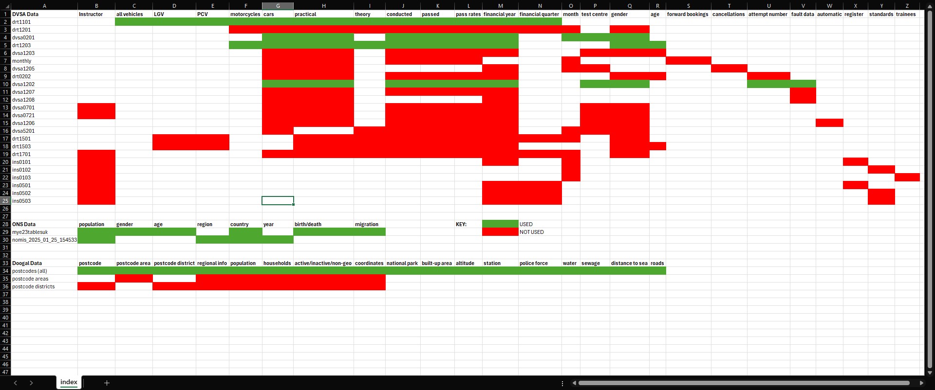
Immediately, a number of things became apparent – the first being that there were large swathes of data that I could already discard from my investigation. I did this with all files relating to driving instructors, and those on some more niche topics such as electric car charging infrastructure. However, most importantly, it became evident that my dataset was much more usable than I had originally thought, influenced in no small part by the availability of driving test centre (DTC) specific data for 8 files. This factor presented untapped potential, because whilst most of the DVSA data would enable the standard fare of line and bar graphs to be made, with geographic data I would be able to create an interactive map on data visualisation software such as Tableau. This would allow users to clearly see DTCs around the country, coupled with the ability to toggle output using the accompanying info on pass rates and test volumes. And, all of which could be enhanced through the creation of filters on those same metrics of age, gender, and time – allowing users to further drill down in their searches. The result would be a dashboard that, whilst not directly addressing waiting times and the backlog, would still be relevant to the issues discussed: helping learner drivers find the nearest DTC with the highest pass rates and greatest testing capacity.
This made all-the-more sense to ask, as it was no longer a given that one would be able to sit their driving test in their actual place of residence. Instead, I could assume that learner drivers would begin their search in surrounding areas; the most time-pressed of those looking even beyond this, assessing the country at large. Creating this index therefore prompted me to adjust my line of inquiry. Where I initially wanted to assess the effectiveness of the aforementioned DVSA strategy, I now wanted my analysis to provide a helpful workaround solution to the problems people were facing. My guiding question became: given my current options, where in the country would I have the best chances of passing my practical car driving test?
Methodology:
Having clearly defined the aims of my project, I now needed to further narrow the selection of data I was working with. I had downloaded 24 unique files from the DVSA, but the exploration phase had indicated this scope was far too wide and risked diluting my focus – most files containing thousands of rows. After some deliberation, I ultimately chose a select few: these would allow me to create visualisations that provided general insights into car test performance, as well as my major goal of a DTC dashboard in the form of an interactive map. For these “overview” visualisations, I also decided upon the exact factors I would use to assess performance: test type (theory vs. practical tests), gender (male and female), age (17 to 59), and the number of test attempt (particularly tests passed on the 1st attempt and/or with zero faults). A condensed version of the index can be seen below for reference, consisting of files: drt1101, dvsa0201, drt1203, and dvsa1202.

First Steps – Overview Visualisations:
I first focussed on completing these “overview” visualisations, as this would require the least amount of data wrangling, relatively speaking. In each case, the DVSA had already formatted data into tables, meaning that in order to extract the exact information I wanted, I simply created a filter over the headings of the table, and arriving at my desired selection, I would copy-and-paste this into a new sheet in a working file. I would then clean certain columns of the data by making sure that only numerical data was present in those relating to statistical values – namely the number of tests conducted, tests passed, and their relative pass rates.
This was important, as the DVSA had filled in some cells with alphabetic characters such as ‘c’, ‘z’ or ‘x’ in the place of stats, in order to indicate confidential, non-applicable, or unavailable data respectively. I removed these alphabetic characters and left them blank – as I knew this would otherwise confuse Tableau when loading data into a workbook. Again, I made use of Excel’s built-in filter tool to identify these values, and delete them. The results of these very basic operations can be seen in the images below – showing an example of what the data looked like in the DVSA file, and then both cleaned and refined in my own separate file. Notably, over the course of this project I would continue to store my refined data in this file, making it easier to load into Tableau all as one Excel workbook.
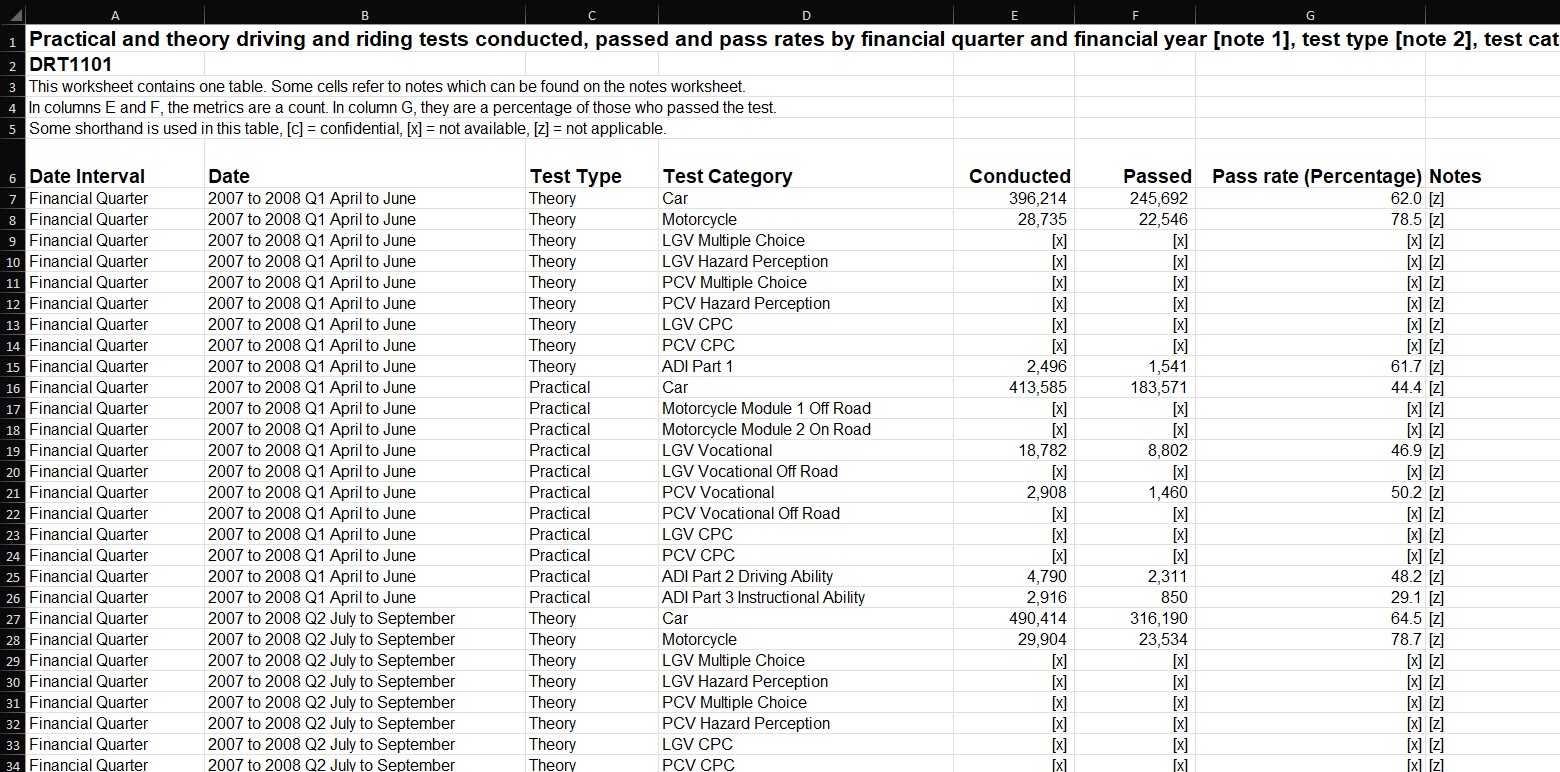
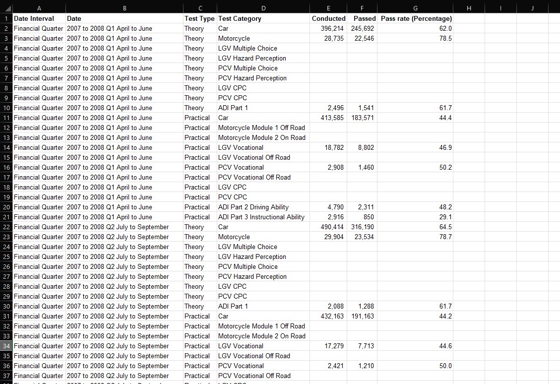
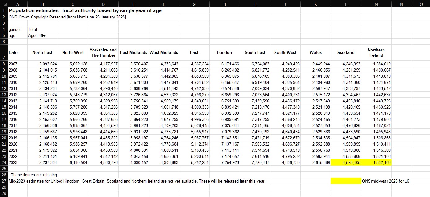
I followed this exact process to extract data from drt1101, drt1203, and dvsa1202, accumulating almost all of the information I needed for my “overviews”. However, I soon realised that given the large regional differences in driving test availability – as had already been clarified by the DVSA’s reports – it would also be helpful to create one further visualisation that would give users a picture of testing capacity by using data on the number of tests conducted, and average regional population counts, to provide a graph conveying tests per capita for each area of the country. My first port-of-call for this information was the ONS, who not only administered the Census, but a whole host of other geographic and demographic data. And, after some research, I was finally able to generate and download a specific table of data from the Nomis website (connected to the ONS) that listed the mid-year population estimates for those aged 16 and over in each region of the UK: North East, North West, Yorkshire and The Humber, East Midlands, West Midlands, East of England, London, South East, South West, Wales, Scotland, and Northern Ireland.
I would omit values relating to Northern Ireland to keep my project focussed on Great Britain; an over-16 age range was also chosen as this is the youngest age from which a driving test can be taken, subject to select circumstances. The resulting table spanned the period of 2007 to 2023 (data on 2024 population estimates are not yet available) in order to align as best as possible with the DVSA data. Importantly, it should be noted that 2023 estimates for Scotland and Northern Ireland were missing in the Nomis download – these were filled in by separately extracting this information directly from the ONS, again for the same age-range. Ultimately, my population dataset can be seen below, although I knew this would still need to be expanded using additional data on tests conducted for each region and year (discussed later).
Developing DTC data – Cleaning:
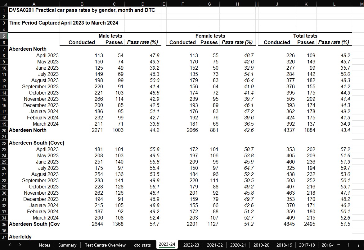
Now with my first data tables in progress, I turned to the 2 files I had selected containing DTC-specific data. I already knew this would be the area of the project in which I faced the brunt of my work, and the reason for this was because of how the DVSA had organised these files. Taking dvsa0201, for each financial year, a sheet was created – in which the names of test centres were connected to stats on the number of tests conducted, passed, and associated pass rates. All of this was further split on gender, such that the aforementioned stats branched off into 3 groups: male, female, and total (the combination of the former two). Whilst this structure may seem unproblematic, the majority of the issues lay in the name column for test centres, with each repeating twice for every block of data, in a sense “wrapping” the data it referred to. This was worsened by spacing between each wrapped-block. The image below hopefully conveys these problems more clearly.
Furthermore, not all of the data for each test centre was complete – causing some cells to remain blank, or populated with a placeholder in the form of elipses. The list of test centres was not the same either for each financial year, as many centres had closed (prefixed by a ‘Z’) or only published data intermittently over the 17 years. I decided to approach the latter problem first – as I wanted to deal exclusively with test centres that had continued to remain open over the whole time range, and were currently recognised by the DVSA. This would create consistency across my entire dataset, and allow me to develop a DTC map with up-to-date and relevant information for its users.
To begin with, I needed to compile that definitive list of test centres. My strategy here was to first replicate the information in each sheet, but with clean formatting and only including the yearly totals for each test centre as opposed to the monthly breakdowns seen above. As such, the column containing DTC names would need to be rid of duplicates and blanks in order to match neatly with those total values. One row for one DTC. I made extensive use of a number of Excel shortcuts and tools here to speed things up, starting with “Ctrl+Shift+End” to select the entire range of data (adjusting with “Shift+arrow-keys” as needed). Copying and pasting the data to an empty area of the sheet, and getting rid of empty divider columns, I then used a filter to exclude month values and blanks from the name column. The resulting table was copied and pasted, and the filtered table deleted – leaving me with a better, but not yet complete, table as seen below.
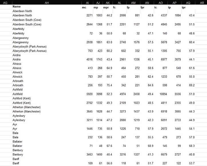
The task here was to remove the duplicates from the name column, as well as the blank rows running in-between all of the numerical data. Again, Excel’s built-in functionality proved extremely useful. Selecting the whole range of DTC names, I entered the Data pane in the overhead ribbon, clicked “Remove Duplicates” and then “continue with current selection” – the result of which was a column of unique values. Getting rid of these excess blank columns was similarly achieved: selecting the relevant range of values, “Find & Select” on the home pane, “Go-To Special”, and then “Blanks” to highlight every cell within the range that was empty. Clicking delete on one of them triggered a pop-up window – via which I chose for non-blank data to be shifted up along the sheet, condensing my dataset and removing all blank values simultaneously.
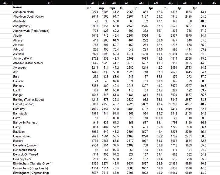
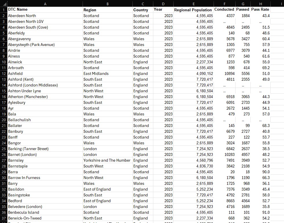
The end-product was effectively perfect on most occasions. Checking that the DTCs matched with the correct numerical data was a very important step in cleaning this dataset, and issues here mainly occurred when certain cells were blank instead of containing the elipses placeholder. Nevertheless, an example of the refined data can be found below – with this process being used for all 17 sheets (financial years) from 2007/08 to 2023/24.
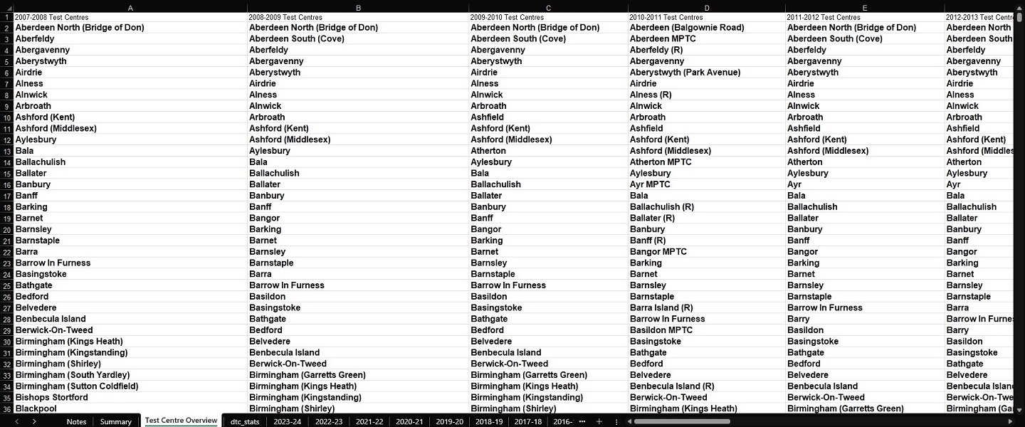
However, at this stage I still needed a definitive list of DTCs that would be consistent throughout the whole date range. Thus, I created a new sheet named “Test Centre Overview”, and decided that I would achieve this goal by extracting all 17 combinations of DTC names – placing them side-by-side in this sheet to begin with. This was quick work, and eventually I had all of the data I needed to be able to compare test centres. I started by first removing all closed test centres from the lists (indicated by the prefix ‘Z’) so that I was only considering locations where a learner driver could actually still take a test. A snapshot of this work-in-progress can be seen below.
Thereafter, I realised that in order to remove duplicates from these values – allowing me to retain only unique DTC names from all 17 sheets of data – they would need to be aggregated into one long list. The function “VSTACK” was of great use here, effectively removing the tedious work of manually selecting ranges one-by-one and placing them on top of one another. Instead, defining a selection of ranges in their desired order would achieve the same result instantaneously. And as before, I accessed the Data pane and used Excel’s built-in functionality to extract all of the unique DTC names. The final result would be a list of 602 test centres – significantly more than the 358 I would eventually arrive at.
Developing DTC data – Refining:
For all of the data wrangling I had done up until now, it was perhaps here that I completed the most time-consuming aspects of this entire project. Verifying which DTCs were still in operation had seemed like a simple enough aim, particularly since the DVSA provided a tool that helped people find the nearest test centres to them. After entering a postcode, a list of DTCs would be returned with accompanying information such as addresses, postcodes, and links to view them on Google Maps and Open Street Map. One could assert, then, that all of the necessary data was available with which to construct a table of geographic data for each test centre.
However, the actual implementation took far longer than I could have expected. A full 4 days worth of work was spent cycling through one repeated process. First, as noted above, the list returned by the DVSA’s tool was not exhaustive: only nearby DTCs were listed. The workaround for this was to use a website that displayed a list of what it believed to be all of the DTCs in the country – in practice, it was mostly correct. I would read the name of a test centre in my list of 602 values, and then search for it on this website. Upon finding it, I would then copy the postcode listed for that centre and paste it into the DVSA’s search tool, a match being returned with all of the accompanying information discussed. I would promptly copy these values for addresses and postcodes into my working table, and would also update the name of the DTC to what it was officially called on the DVSA website, so as to remove any discrepancies.
It should be noted that this was the best case scenario. The vast majority of times, test centres in my list would no longer be in operation – which I could only verify through the combination of their absence in the DVSA tool’s search results and a Google search. Otherwise, test centres would be listed multiple times under variations on the same name. As stated above, by the time I had run through all of the DTCs, the count of 602 was cut down to 358 unique values, finally providing me with a definitive resource (seen below).
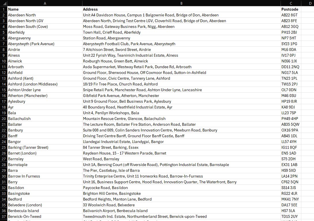
That said, I still knew this was far from complete. Namely, if this table was to be used to create an interactive Tableau visualisation, it would need latitudinal and longitudinal information to pinpoint the locations of DTCs on a map of Great Britain. And, in order for any statistics on driving test performance to be linked to these test centres, I would also need to update each of the 17 financial year sheets in dvsa0201, so that each contained information for the exact same list of 358 DTCs. This would effectively ensure that all tables containing data relating to DTCs across every one of my files would be consistent – later proving particularly useful when using SQL to enhance my dataset.
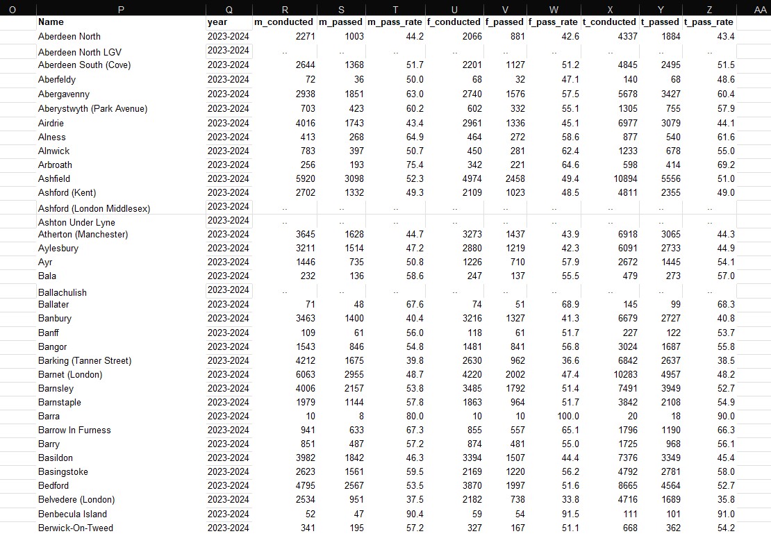
I decided to first complete this latter task – again, a very tedious process that took multiple days to finish given how manual the process was. Importantly, where any of the sheets did not list a DTC out of the 358, I would still insert it into the sheet, but would enter the elipses placeholders where the numerical values would normally be. Furthermore, a new column was created to attach the financial year value to each row in the dataset. An example is shown below for reference.
Developing DTC data – Doogal:
Now, it was finally time to connect coordinates to those DTCs. For this portion of the project, I made extensive use of the resources provided by Chris Bell – the creator of a website called Doogal that offers comprehensive breakdowns on UK postcode data in a variety of formats. I was particularly pleased as it was possible to download a huge CSV file (1.94 GB) that linked every single UK postcode to all sorts of geographic information – the scope of which I attempted to convey in my working index below.

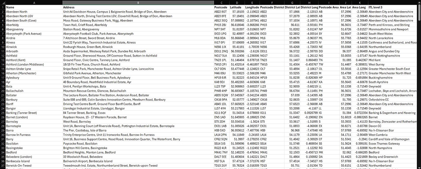
For a sprawling dataset of this size, however, I would have to move beyond Excel. This was the perfect use-case for SQL, which I was able to use via a free Database Tool: DBeaver. The SQL flavour I used was PostgreSQL. The main goal here was to upload the postcode CSV to DBeaver, followed by a separate CSV containing my refined list of DTCs with their accompanying addresses and postcodes. Once completed, I would then construct a basic SQL query that conducted an “INNER JOIN” on the two tables: connecting them on those 358 postcodes, and allowing me to pull in all of the relevant geographic data I required. The overall process took 2 hours given the sheer volume of data I uploaded from the postcode CSV – amounting to a count of 2,696,574 rows. My final SQL query can be seen below, along with the results table that I would export as a CSV to use in dvsa0201.

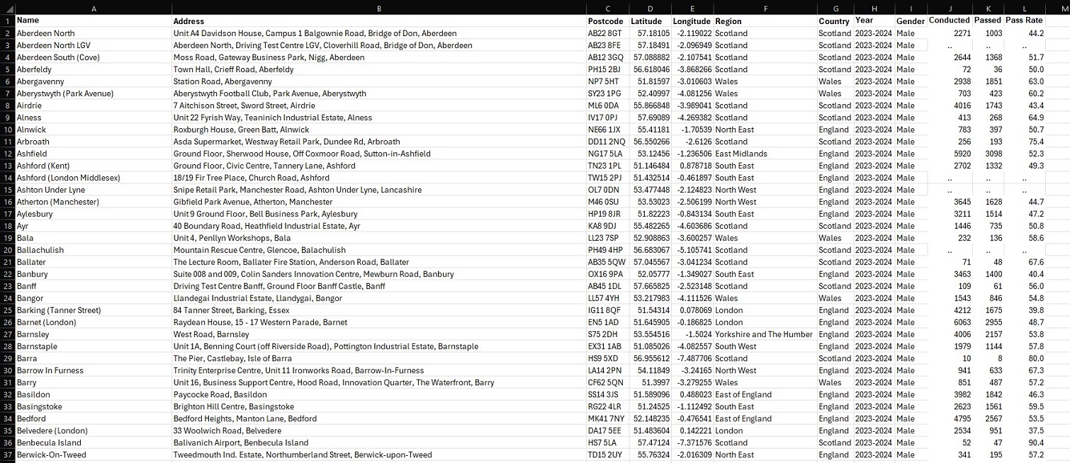
At this stage, I was only a few steps away from finalising my DTC dataset for 17 years’ worth of data. For each financial year in dvsa0201, I copied the information on testing performance into a new sheet called “dtc_stats” – stacking each year on top of one another. The new geographic information from my CSV export was then manually attached to all 17 blocks of data. Furthermore, to avoid potential hiccups in future, I decided to separate statistics for each gender so that each row did not contain male, female and total values all in one. This was achieved by creating a new column specifying the given gender, and effectively tripling the dataset such that each row only referred to one gender’s performance statistics for that financial year. The results can be seen below, culminating in 18,258 rows of DTC-specific data ready to be analysed and visualised.
Admittedly, whilst I had initially made plans to complete this entire process for dvsa1202 (containing further DTC-specific data on performance by age), time constraints ultimately forced me to set this ambition aside. I did, however, revisit my population data from Nomis – and extended this with the test centre information above. As originally intended, this would enable me to visualise yearly tests per capita for each region of Great Britain, placing this against the number of tests conducted and average population estimates. And with this, I was finally prepared to take my data to Tableau.
Final Touches: Visualising in Tableau:
Compared to the full days I had previously put into data wrangling, all of my work in Tableau was completed within one single hour. I feel that this project quite successfully proves that common understanding in the world of data analysis, that the vast majority of your time will be spent preparing data for the insights you will extract in no time at all. At least relatively speaking… Aside from needing to convert a few columns into the appropriate data-types, neatly organising my data had massively paid-off. Each sheet was loaded into Tableau as a unique data source (given there were no real relationships between the information in each sheet), but the headache of importing from a multitude of different files was avoided by having everything contained within the same Excel workbook. And, with my data ready, I was swifty able to create visualisations – starting with those “overview” graphs I had previously outlined in my Methodology, and ending with a finished DTC map of Great Britain. The view from within the worksheet of each visualisation has been pictured below, as this should more clearly demonstrate how each was achieved.
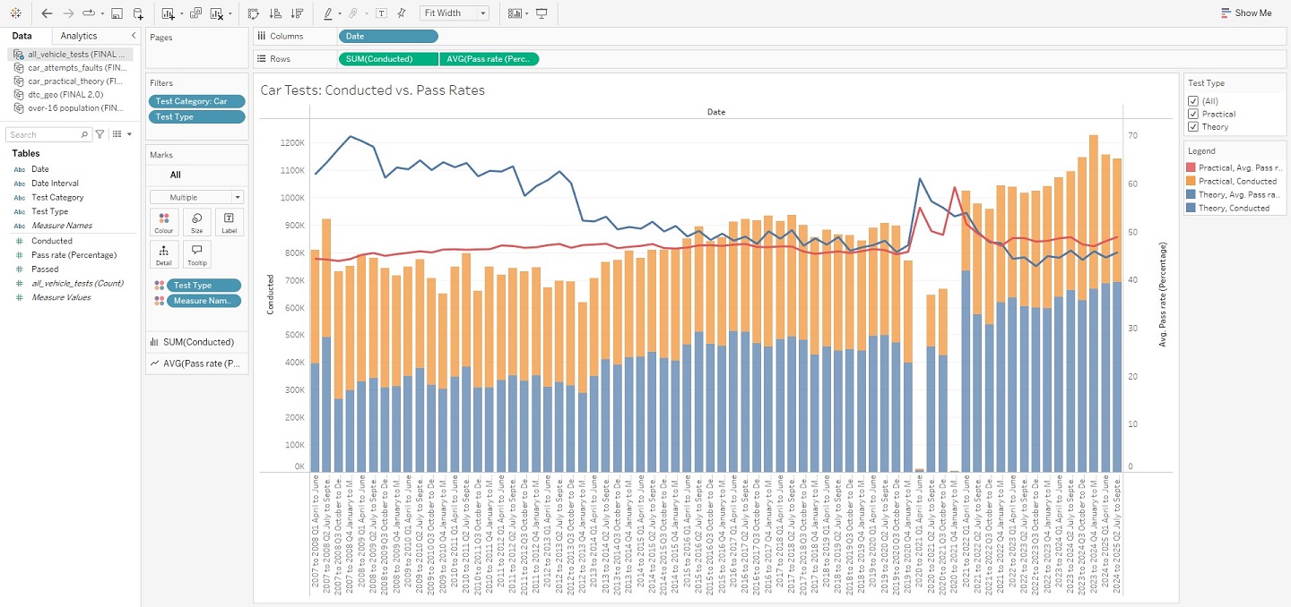
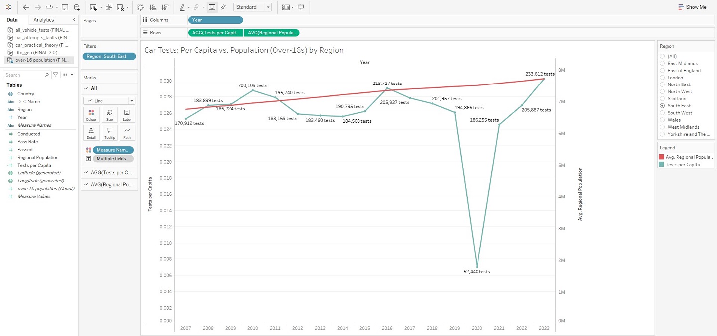
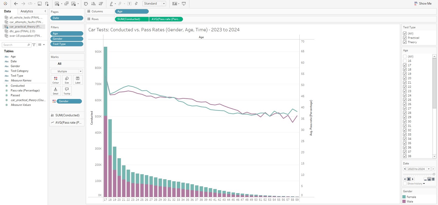
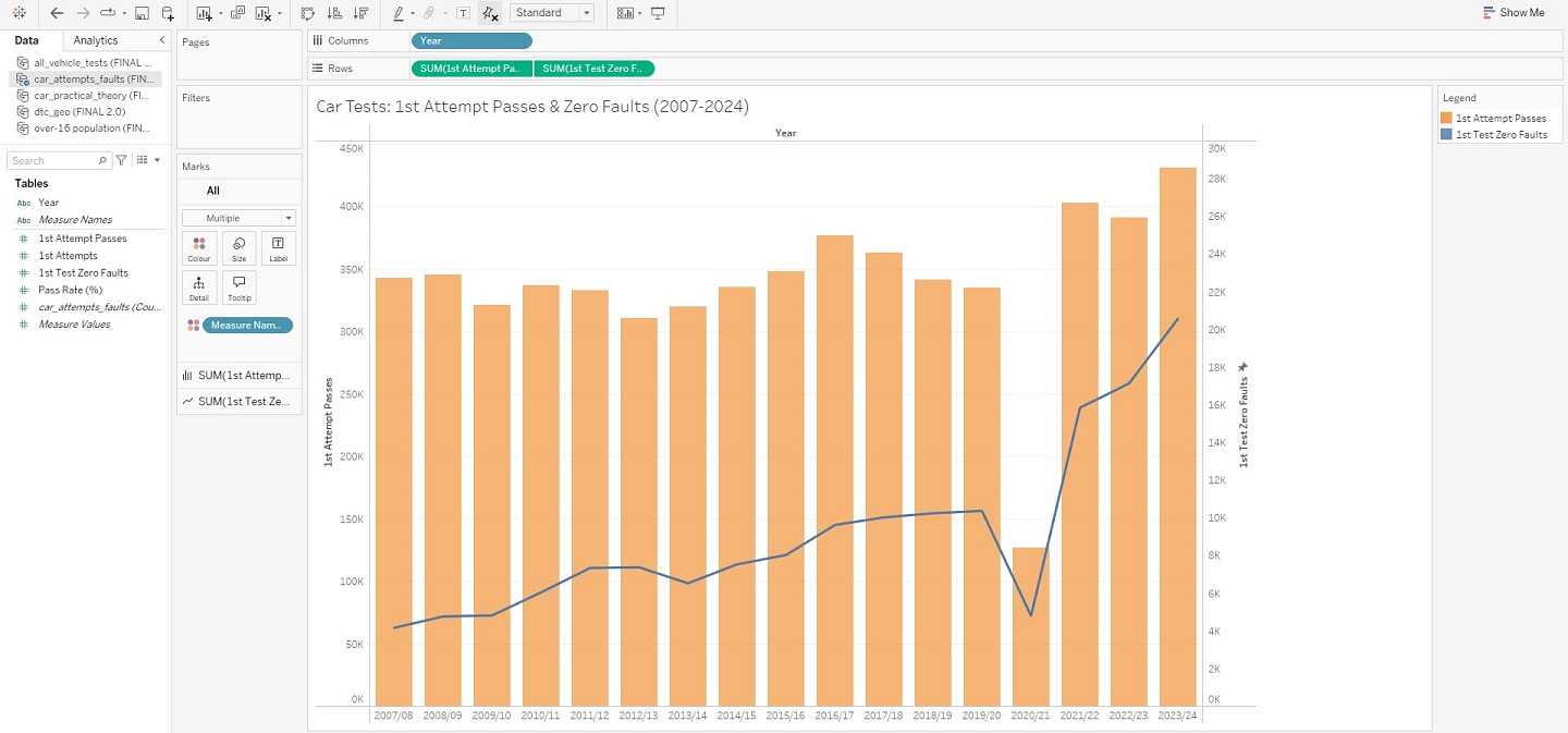
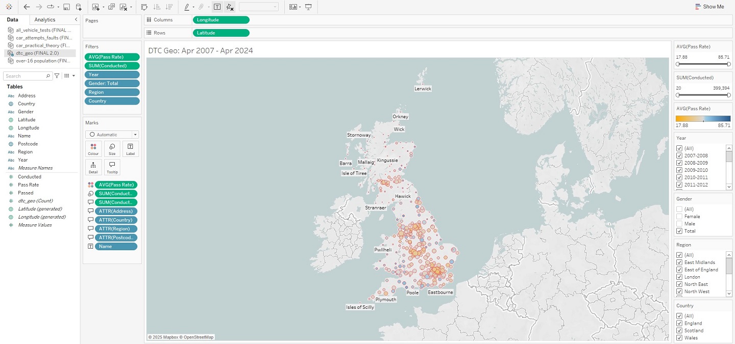
And that’s a wrap! There is, of course, more to this project than what has been shown here in this article, but these snapshots hopefully convey that getting into the weeds of a dataset can lead to real insights, and (hopefully) foster positive change. Indeed, that is what I ultimately want visualisations such as these, and in particular my interactive DTC map, to bring to people using them – should they also happen to be in need of a driving test. I do also appreciate that whilst images are helpful, a more detailed breakdown of how this was all achieved in Tableau would be better still. This is why I have uploaded my project to Tableau Public – allowing you to interact with this data story and download it should you wish to uncover its inner-workings. Just visit my profile via the link here. This has been an analysis of car driving tests in Great Britain, between 2007 and 2024.
Bibliography:
- BBC, ‘Harder theory test leads to falling pass rate’
- Doogal, ‘UK Postcodes’
- Driving Test Centres
- DVSA Data
- DVSA Despatch Blog, ‘What is causing the long driving test waiting times’
- DVSA Despatch Blog, ‘What the driving test waiting time actually means’
- DVSA Despatch Blog, ‘How driving test waiting times are looking at the end of January 2024’
- End the Backlog campaign
- GOV.UK, ‘Driver and Vehicle Standards Agency’
- GOV.UK, ‘Driving lessons and learning to drive’
- GOV.UK, ‘DVSA sets out plan to reduce driving test waiting times’
- GOV.UK, ‘Find a driving test centre’
- Marmalade, ‘New data suggests the driving test backlog may never end unless testing capacity drastically changes’
- Money Super Market, ‘How to beat the driving test backlog’
- Neil Obrien Substack, ‘New data on the driving tests crisis’
- Nomis, ‘Population estimates – local authority based by single year of age’
- Office of National Statistics, ‘Estimates of the population for the UK, England, Wales, Scotland, and Northern Ireland’